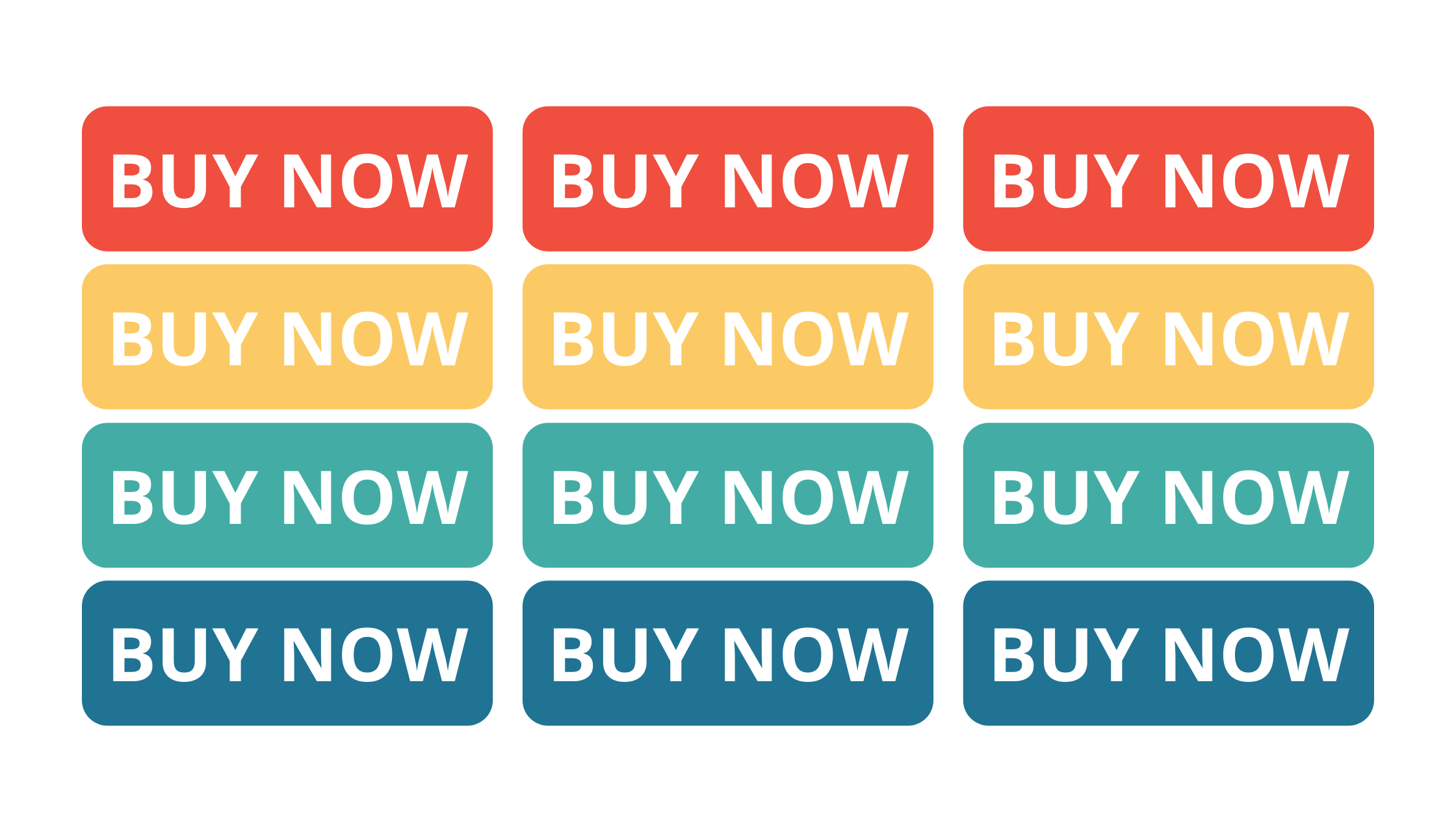
Conversions spell success for your business. Clicking that button, whether it be “get started”, “buy now”, “subscribe”, or more, means more leads and sales for your company. Enticing your potential customers can be tricky. Choosing the right call to action colors can make the difference for your conversion rate. So, how should you color your CTAs?
Contrast is Key
Using contrasting colors is vital to getting your call to action noticed. To catch the eye of your website visitors, make sure your CTA is eye-catching both across your website and within the button itself. Make sure any text is easy to read, and make sure there is high contrast between the button and background color. A great example of this was found in a test by Hubspot. While a green button color corresponded to their brand theme, and fits well into the page design, the red button out-performed the green by 21%!
However, it’s important to note that this doesn’t necessarily mean red would work for your website. As a general rule, we tend to advise our clients to avoid red. It can be a “stop color” for your website users – our brains are trained by traffic lights, warning signs, stop signs and more to correlate the color red with stopping! So unless you see test results like Hubspot, it’s good to avoid the color if you can.
Stay Consistent
Consistency not only encourages higher conversion, but it also allows for a better overall user experience. Your users will associate whatever color you use for your CTA with taking action. That’s why it’s so important to stay consistent, in addition to using contrasting colors. Use that color sparingly; do utilize it for all your CTAs on your site, but don’t use that color for non-action items like regular text or headings.
Be True to Your Brand
Your brand is the personality of your business. Make sure the color you choose for your call to action buttons aligns with that personality. Stick to your brand identity while using colors that draw attention. If you’re struggling to understand what would fit your business, do some research on your industry and what colors might make sense. Check out this blog about the role of branding in marketing to learn more.
Know Your Ideal Client
Investigating your audience can give you some insight into what might be a good color for your call to action. Understanding your target demographic, age, gender, occupation, etc., while it should not be the only factor of consideration, it gives you an understanding of what will be appealing. From there you can narrow down your color while considering the other factors of your brand identity, contrast, and consistency. Struggling to understand who your ideal client is? Click here to learn about our free mini course to help you narrow your search and start marketing to the right people.
Struggling to Decide?
There’s no right answer for knowing which CTA color to use for your business, but it’s important to utilize what works best for your business. As a general rule, more visibility means more noticeability and conversions from your page visitors! However, a color that works for another business might not work for yours. If you’re still stuck between two or more colors for your button, run an A/B test to see which color performs best. You might be surprised!
What are your thoughts on the colors of CTA’s? Leave your thoughts below! Struggling to build up your website? If you want a site that works for you, Byte Size Digital can help. We offer comprehensive marketing plans, marketing forward websites, one on one coaching, and self guided courses to help entrepreneurs thrive. Schedule a call to get started!


