The task of building your own website can seem daunting. Fortunately, there are so many great resources for spinning up an inexpensive website in only a matter of hours. While there is a lot of design freedom in these drag-and-drop website builders, there isn’t always a lot of guidance in terms of how to design it in a way your customers will love. We totally get it – you don’t have the time to go through weeks of courses to learn web design and development, but what you can do is learn the industry best practices. Knowing what to look for and how to fix things will be extremely beneficial when it comes time to build your own website. Let’s dig in.
Web design best practices:
Colors
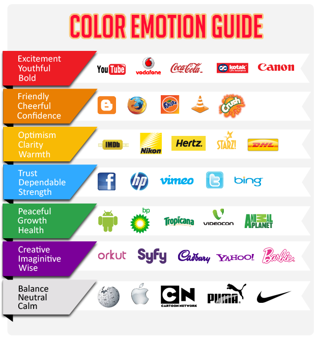
Believe it or not, color actually has a huge impact on your audience. A website drenched in the color red will evoke a different feeling or reaction than if a website was covered in blue. That being said, your brand colors are most likely giving off a certain vibe to your customers. The color guide below from Bode Animation will give you a good idea of the feelings that come from certain colors. Using pops of your brand colors throughout your website will keep your design consistent and encourage brand recognition.

Typography
Even the smallest detail like font type can make or break a good website. The text on your website should be easy to read, meaning using a visual hierarchy to guide your users’ eyes and choosing a readable font. As a best practice, the body font of your website should be sans serif. See the difference between serif and sans serif below.

A visual hierarchy means organizing your website content in a way that will make sense to users and highlights the most important information. Headers and subheaders should be utilized and stand out to break up paragraphs of text. Additionally, your text should be readable on all screen sizes and be able to change for users that have sight issues. In this article, Jason Pamental lays out the most effective font sizes for different mediums and screen sizes.
Call-to-action
Your website has a purpose – whether it’s to sell more, get donations, grow your email list, or spread a message; your website is an employee that’s working for you 24/7. Calls-to-action are an awesome way to encourage users to do what you want (it sounds weird, but it’s true). Without direction, your website visitors may just scroll around a bit and then exit your page. Utilizing links and buttons (e.g. Buy Now, Donate Now, Click Here) will let your users know exactly what you want them to do. Typically, these calls-to-action are placed at the top of a website – somewhere your users won’t have to scroll far to get to. Let your website be your best salesman.
Web development best practices:
Mobile-friendly
At this point, if your website isn’t mobile responsive, you’re probably losing customers. There’s nothing more frustrating than pulling up a website on your phone and having to zoom in on every paragraph and button because it’s only built for desktop. Smart mobile design includes:
-
A hamburger menu to click on (rather than a full-width navigation menu)
-
Short snippets of text that get to the point (so that not a lot of scrolling is required)
-
Responsive images that scale as you change screen size
-
Text that’s readable (reference the article by Jason Pamental linked above!)
-
Fast page-loading
Page speed is extremely important on mobile,because users will likely not wait for your page to load. Additionally, a mobile-friendly website is beneficial to SEO! In a search, Google will label your website as “mobile-friendly,” which gives you a slight ranking boost.
Analytics tracking
If your website is your best salesman, it’s good to know if a particular page or button is having a big impact on your audience. All small business websites should be using Google Analytics, not only to see where you’re crushing it, but to see where you can improve. Tracking this data is as simple as adding a bit of code to your website header. I know, the ‘C’ word is scary, but this guide on getting started with Google Analytics will take you step-by-step. If you still have questions about setting up Google Analytics, feel free to start a chat with us!
SEO
We touched on the importance of ranking in Google earlier, but there’s more you can do to get higher rankings in search engine results. Search engine optimization is huge, but the basic gist is making changes to your website that affect it’s online visibility. Using targeted, industry-related keywords throughout your website content will influence how high your website ranks. Mastering SEO is no one-day task. Take your time and check out this Beginner’s Guide to SEO from Moz. Including SEO on your website is as simple as installing a plugin or app. If you’re using WordPress, Yoast SEO is an awesome plugin for adding SEO to every page. If you’re using drag-and-drop website builders like Wix or Squarespace, they often come with SEO capabilities built in.
There you have it. You’re armed with website design and development best practices to go forth and crush it! We’re pleased to say, an inexpensive website doesn’t have to look cheap. Follow these tips and watch your site traffic and conversions grow. If you have any questions or need any help with your website, feel free to give us a call, open up a chat, fill out our contact form, or even send us a carrier pigeon.


