Branding is an action. It is the marketing practice of actively shaping your brand. Your brand is the combination of all tangible and intangible aspects that represent your business. The tangible elements consist of things like: your logo, fonts, marketing materials, etc. The intangible includes: your mission, vision, vibe, perception– that gut feeling customers have about your company. Combining these elements together creates your brand. The aspect we are going to focus on is color pallet. This ‘tangible element’ seeps into multiple areas of your brand (logo, marketing materials, etc.) and is often the first feature customers notice. So, how do you go about choosing such an important element? Like all decisions regarding your brand, your color pallet should align with your ideal client. Looking first at the psychology associated with brand color you can then decide on which colors would resonate with your ideal customer and the perception you would like them to have of your business.
Brand color psychology is the study of how colors impact perceptions and impressions of a brand and whether or not they persuade consumers to make a purchase or favor a particular business. Although the exact effects that colors have on a person will be impacted by their personal experience, culture, gender identity, etc., there are guidelines that have been supported by countless studies.
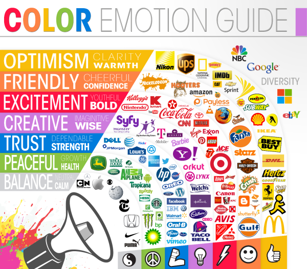
Here’s an overview of the psychology of color and what emotions and images colors can bring to your branding.
Red: Red is a big color. It is associated with power, strength, and high-energy. Red has the longest wavelength of all the colors, and so appears to be nearer than it actually is. It has been shown to reduce analytical thinking—it speeds up and intensifies our reactions. Facilitating quick decision making.
Orange: Orange is associated with feelings of excitement, fun, enthusiasm, and warmth. It is found in the branding of many sports teams.
Yellow: Yellow is cheery and stimulates the brain. It is the color associated with optimism, happiness, and inquisitiveness. Yellow has been known to increase appetite, and can lift self-esteem when utilized correctly, but too much yellow can also trigger feelings of anxiety. Because it has a relatively long wavelength, it is the most visible color; it’s stimulating and attention-grabbing.
Green: The color green is the easiest on our eyes because it requires no adjustment when it hits the retina. Green is associated with peace, nature, and health. It can also symbolize luck. Green resides in the middle of the spectrum and is the color of balance.
Blue: Serene and calming, it is the color of clarity and communication. According to brand color psychology studies, blue is the most common favorite color among the world’s population and is particularly preferred by men. Blue is a reliable color often seen in branding.
Purple: Purple or violet is the shortest wavelength and is the last to be visible. Known to convey royalty, wealth, and wisdom. It combines the energy and strength of red with the spirituality and integrity of blue. Purple is often associated with time, space, creativity and imagination.
Pink: Pink is associated with love and romance Often connected with emotional balance and physical harmony. Pink is portrayed as feminite.
Brown: Brown is thought of as a sturdy color. Composed of red, yellow, and black it is bold yet warm. It is associated with reliability, nature, and support.
White: White is the absence of color and has long been associated with purity and innocence. In branding white is thought to be minimal, modern, and fresh. Often used in healthcare and associated with cleanliness.
Grey: Grey is a subtle color often associated with technology, luxury brands, and sophistication. Grey is the only color shown in studies to have no dominant psychological characteristic.
Black: Black is the combination of all colors. Black is thought to be stylish, powerful, and classic. Similar to grey it is associated with sophistication, but in contrast black is considered conceptually bold

Infographic 1 From Visually
Infographic 2 by The Logo Company
Information for this blog gathered from: “The Power of Brand Color Psychology: Ignyte Branding Agency.” Ignyte, 17 Dec. 2021, https://www.ignytebrands.com/the-psychology-of-color-in-branding/.”


 .
. 